Anton Kimball, the designer behind several iconic food brands, on what constitutes great packaging design.
Anton Kimball, owner of Anton Kimball Design, is the brainchild behind some iconic brand designs, such as Guinness, Ritz Crackers and Nordstrom. Food packaging is now the Portland designer’s main line of work.
In this interview, Kimball discusses the biggest trends influencing design and why Art Deco is back in fashion.
This interview has been edited for length and clarity.
What is the next new thing in brand design?
In the late ’60s, one of the most influential design groups in the U.S. was Push Pin Studios. One of the founders, Milton Glaser, is world famous. Their major influence was Art Deco. They did illustrations, letter forms.
One of the design trends for 2019 is Art Deco. In Portland there are recent examples of Art Deco. The logo for Renata, the Italian restaurant [in Portland], that would be perfectly at home on a bistro or olive oil label in Venice from 1938.
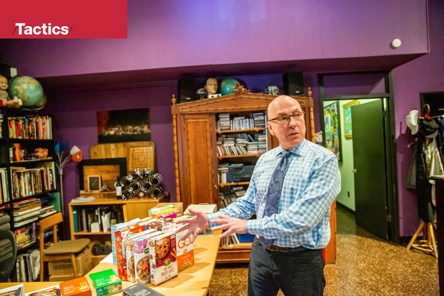
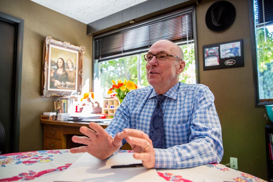 Photo: Jason E. Kaplan
You are in your element then, since Art Deco is back in fashion?
Totally. It is great. I am so old — this is the second time it has been fashionable. The Ringside Steakhouse [in Portland] — I redid that logotype, and it is very much Art Deco. The Nines Hotel [in Portland] — that is very much in the style that is informing a lot of decorative design.
Art Deco is not the only thing happening. Brushstroke lettering from the ’40s, ’50s and ’60s is making a comeback. Look at the logo for Spella Caffè or Doug Fir Lounge.
Also, a lot of logotypes that are popular here in the West look like badges — they may have elaborate typography that take circular forms. Think of the Timbers logo or the Portland Thorns.
What is the biggest mistake businesses make in creating their brand?
You have to be clear what your business means to you and what you want the world to think of it.
When you create a logotype or brand, you should plan how long it is going to last. Has it got potential to be updated and refreshed? You can build in the idea that you will need to update it.
Some logotypes are restrictive. One reason a badge is so popular is it is so easy to apply and fit on things. You can wear it, you can stamp it on things.
What is the hardest branding project you have worked on?
I redid Ritz Crackers. That has been a brand that has been around forever. I learned that by updating it, I could actually make it older. Ritz Crackers is based on an Art Deco alphabet. I just returned it to its origin.
We did experiments that showed that if they redid the package every 18 months to show there was energy, they would get a 15% increase in sales for about 45 days. Don’t get completely attached to your brand.
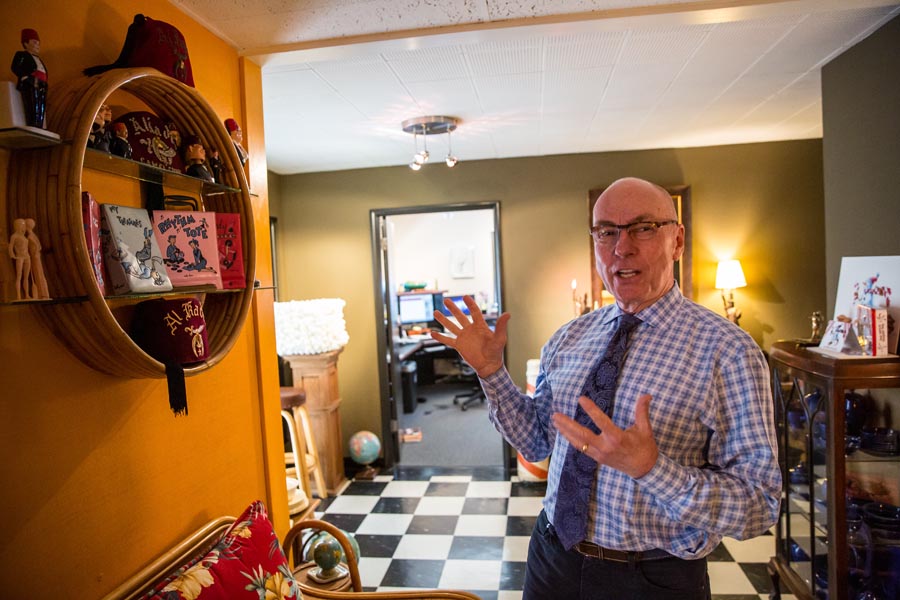 Photo: Jason E. Kaplan
Is there any particular design trend for food that everyone is going for?
I think you will see bright color and maybe ’60s color. It is not unusual to see pink and bright lime green, purple — colors that might not be associated with a specific food but came from an era.
Design in a competitive circumstance is always contextualist; it depends what the product is next to. Look in the beer aisle. The microbrew business in Oregon is great because of all these small breweries.
The traditions of beer-label design have gone out the window. There are wild packages on beers I like, such as from Gigantic Brewing Company. The labeling is killer stuff. It looks like Japanese anime or monster-movie posters.
Does the new style of craft-beer labeling do enough to make them stand out?
I don’t know if they stand out. A lot are hard to find. If you want to be a success in Portland and the Northwest and have a small brewery, that is great. But there has never been a national beer that came in a six-pack that didn’t use metallic foil with silver and gold on them.
Any really big beer with a national audience will use those cues. I haven’t seen any national successes that don’t respect the tradition of it.

Minimal food-packaging design seems to be a thing. Is it a trend of the future?
It is self-limiting. It is in beauty products and super-high-end pet products. But the requirements of getting information on a package in food keeps minimalist packaging at bay.
The labeling requirements from USDA and FDA dictate so many things that have to happen on the face panel, that wards against minimalism.
How important will sustainable packaging and the minimal use of plastic become?
Everybody would like sustainable packaging. A lot of food packaging is on a carton or a paper box. That is biodegradable and recyclable. It is plastic that is a bugaboo.
Until completely biodegradable plastics get invented, that will always be a challenge. In Europe there is a lot of interest in making all plastics recyclable and coding them so the recycling plant knows what to do with the package.
That is just starting in the Americas. I think this is all solvable if designers get together.
Why do you think there is resistance toward more sustainable packaging?
A lot has to do with money. If you can print anything you want on paper or board and do it with high-resolution artwork, and then somebody says you can make this product out of recycled wood but you have to screenprint it and you can only use one or two colors, that requires a real discipline for the design.
It is often hard to make a competitive package with those limitations imposed.
The food world is very competitive. We work with a lot of entrepreneurs. They are coming up with a new item — it doesn’t matter what the product is, the store isn’t going to build a new shelf for it — something has to go away or be dropped.
A lot of what we do is create strategies or even things to say to a store buyer to get them to accept our clients’ products.
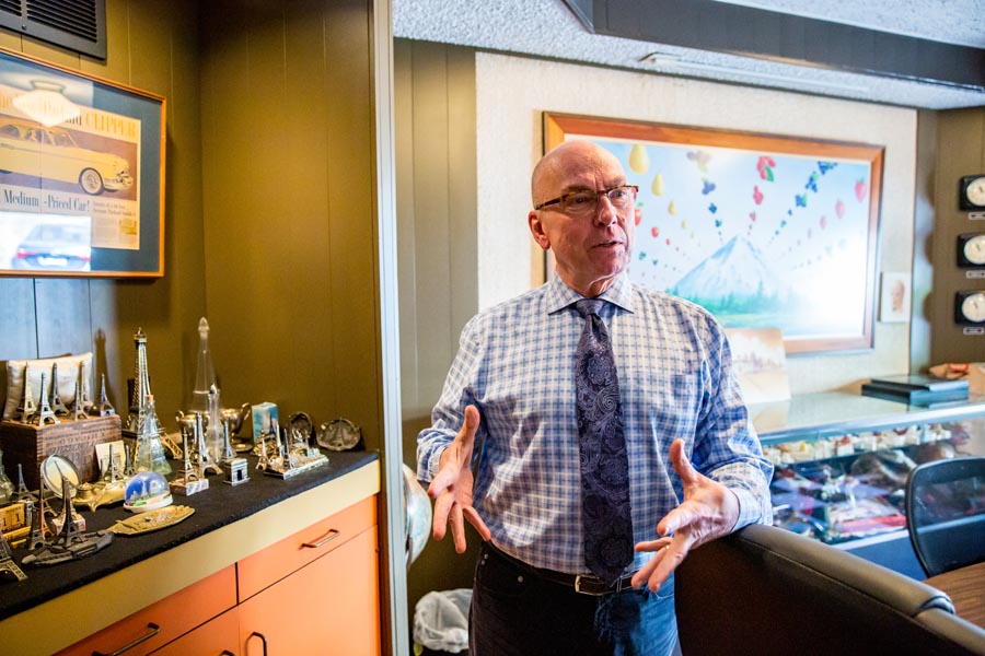 Photo: Jason E. Kaplan
What impact does the rise of e-commerce have on design?
It makes it desirable to turn your package into a poster. At an inch tall on Amazon, it looks great. That requires distillation and care.
We have several packages we have done just for online sales. If you know what is on the same page as you, that is helpful, because you can contrast with those designs.
If everything is colorful, you could make your design monochromatic or white. If everyone is using rust-looking craft paper, you can use extremely bright colors to contrast with that.
Shelf circumstances are easier to control because you can use color schemes that make a group of packages look essential or complete. I was explaining some rice packages we did to a buyer at Whole Foods; I said these packages are best arranged in groups of four — they make analogous, complementary color schemes.
There are three colors together on a color wheel, like yellow and orange with the opposite in the middle, which is a blue green. There is something satisfying about seeing those together. It is like a chord in music.